PROG2001 Assignment 2
Cornelius Deasi Jnr, - Assignment 2 - Grey Box Prototype Project
Directions
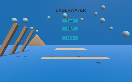
The menu page shows up with 3 buttons of "Play", "Help" and "Exit. The user has the option of selecting one of this 3 buttons. The help button takes the user to the help page to guide them on how to go about the scene with the option of going "back" to the main menu page.
The "Play" button takes the user to the next scene where there are 5 buttons on which the user can click on to go to the main scene where the character of a fish is displayed.
The user can interact with the character by clicking on the buttons on the top of the screen, by clicking the move buttons to move the object left and right, the resize buttons which consist of shrink and grow, the main menu button to go back to the main menu, as well as the reset button to reset the character back to its initial position. And finally the rotate buttons to rotate the object left and right.
UX Principles
- Consistency of colors
- Underwater theme so a blue / aqua color was used for the ocean effect
- Used the same theme across all scenes.
- Used the bubbles background on al the scenes to sow that consistency of assets used.
- The colors of the buttons used is roughly the same as the background color, this could be better enhanced with a lighter color against the dark blue of the ocean.
- Hovering Effect
- Incorporated the hovering effect on each of the buttons as well as the function of pressed, selected and highlighted when the user interacts with the button.
- Emphasis
- Emphasis on the buttons as well as the texts to attract the user to click them.
- Groupings
- Buttons and texts have been grouped accordingly (i.e. - and + buttons grouped with the "Resize" text to show the user where to click if they want to shrink and grow the object).
- Navigation
- Consistency shown in the navigation where it is displayed on the top of the screen.
- Font Style
- Font style is consistent across all the scenes with a bold size 24 sans serif font used on the buttons across all the scenes.
- Font style bold size 30 Arial used on all the texts across all the scenes.
- All texts capitalized.
Comments
Log in with itch.io to leave a comment.
great design consistency and hierarchy. Navigations are clear and easy to follow. controls worked perfectly and the Fish respond accordingly. But I would like to comment on your game scene, you should have added some reefs or sea weeds or any other sea materials to your scene. Overall, a job well done.
Thanks Victor for the feedback, I'll make sure to add those changes in A3,
Your design is perfect just the way it required to be. Excellent work.
Thanks for the feedback Jamie
Cornelius Deasi Jnr keep it up, the screen resolution fits the screen, the buttons are shown properly, the text is in the right format, the colors are used accordingly. The characters moves accordingly, job well done.
One thing to take into consideration is that when the user click the button the button should be interact heavily so that the user feels that it is clicking the button.
Overall it is fine.
Thanks Jordan for the feedback, will keep that in mind when doing my assignment 3
The design, with meticulous attention to specifications, your use of colors, and the details in the scenes, is in keeping with the theme. The visuals encourage user interaction. You maintained good UI consistency within the different scenes, providing well-designed and familiar button types; even without words, I knew what to do and what would happen. Accompanied by comprehensive design specifications, detailed storyboards, and a mood board that reflects the envisioned atmosphere, the project exhibits a cohesive and engaging narrative.
Thank You Robert for the feedback, appreciated
The UX is great, as is the concept; it was fun interacting with the fish. The design, your use of colours, and the details in the scenes are in keeping with the theme. The visuals encourage user interaction. You maintained good UI consistency within the different scenes well-designed and familiar button types; even without words, I knew what to do and what would happen. The functions work correctly, and I received the expected feedback immediately. My only thought was the location of the rotate buttons. Great Job!
Thanks for the feedback, I've updated the rotate buttons so they are next to the move and resize buttons,
Good Work Cornelius. Looking forward for the final product.
Thank you Mr. Jobin for the feedback